Engaging audiences on Twitter using imagery isn’t a box-ticking exercise. Frameworks need to be understood and creativity needs to be applied.
All communication rests on two things: frameworks and creativity. Frameworks provide the structure you need to tell your story. Creativity is the fairy dust that separates the winners from the also-rans.
Language is a framework. It has rules and structure. Some can be broken or circumvented. Others must be followed in order for people to understand what you’re saying. Once you have the framework, you need to apply creativity. Shakespeare, Dickens and Steinbeck all applied creativity but they worked with a framework. They understood not just grammar and punctuation but cadence and rhythm and a million other tricks and skills which they applied creatively.
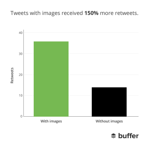
Practically every day, people tweet out a fresh stat about how tweets that are accompanied by images increase engagement or clicks or retweets or sex appeal or some such.
Twitter timelines have duly been flooded with images. Great. Box ticked, now let’s think of how else we can get audiences engaged.
Except it’s not great. It’s just a big mishmash of poor, creativity-free images that don’t quite work. People know the stats but they don’t understand how to act upon them.
Images have a framework too, and when used on Twitter that framework is even more complex. In order to use images creatively, in order to achieve those amazing engagement stats, it’s important to understand the framework you’re working within.
Tech specs
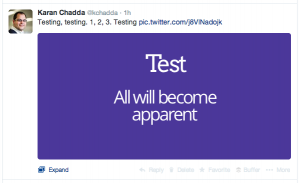
Unhelpfully, Twitter doesn’t release information about the size of images in its timeline previews. An established rule of thumb among online groups is that images appear in a ratio of 2:1. A bit of a poke around the code behind a desktop Twitter feed reveals that images are delivered at 506 pixels wide. So a 2:1 ratio would have images at 506 x 253 pixels. Images uploaded in this size do indeed appear fully in a feed. In fact, the only part of an image uploaded in this size that disappears in a timeline preview are the corners which Twitter likes to round off slightly.
Now we have a starting point. We have a size we can confidently build up from and a ratio we can use and then manipulate. So that’s the framework sorted, right? Wrong. Substantial portions of Twitter’s users access it through a mobile device. So we need to think about tablets and smartphones and different operating systems. On an iPhone an image that’s 506 x 253 pixels is cropped in a timeline. This is where complexity comes in.
Algorithms
Normally, when coding for the use of images for websites that are used across different devices, engineers will set break points and set out the specific parts of an image that should be used at each size. Typically, they’ll focus on the centre of the image and then work their way out from there. So on a smartphone you’ll see a small part at the centre of an image, on a tablet you’ll get more but still from the middle, and then on a desktop you’ll get the whole image.
Twitter’s engineers and designers appear to have broken away from this. There’s clearly an algorithm at work that’s trying to work out the most important part of an image and then focus on that. Playing around with some images on Twitter, I’ve discovered that on simple images with a clear focus on a single subject the algorithm works reasonably well. Images with a high contrast between different elements are understood well too.
There’s a certain amount of guesswork involved and, for the vast majority of people, I think only experimenting and experience will lead to an intuitive feel for what will work. As a rule of thumb, high contrast, simple images with the subject right in the centre will work well.
Conventions
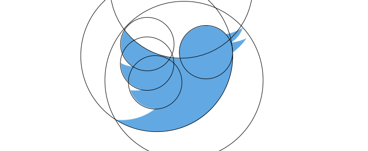
That’s the technical stuff, but the framework for using imagery on Twitter doesn’t end there. Imagery, like language, has its own conventions: emotion through eyes, the rule of thirds, triangular composition, the golden ratio… the list is endless.
No one would, nor should they, spend a long time thinking about these things when deciding how to use images on Twitter. However, someone should spend a very long time defining these for a brand.
Every brand will have a tone of voice; it should have an image style too. The style should be adhered to unless, on occasion, there is a good reason to break away from it. That style should be translated to Twitter. It need not be rigid but it must be thoughtful and easy to apply. It should work with the technical information we know about how Twitter treats images. Crucially, it should also work with our understanding of how people engage with imagery. If it does those things, then it is a brand framework that should help achieve those outstanding engagement results that everyone wants to hit.
So, that’s the process for sorting out the framework. The creative is up to you.